Colors
Last updated
Was this helpful?
Last updated
Was this helpful?
Although it's possible to jump into Keystone and start picking colors, we recommend doing a bit of prep work beforehand. This ensures you have a solid idea of the direction of your brand and the colors you want to use.
If you don't already have a set color palette for your brand, it's useful to spend some time deciding on this direction. You can use free color palette generators, such as , to help with this process.
There are a handful of great resources online that can help guide your color selection process, including
You can adjust all colors in Keystone using the global color settings. To achieve better results and improve design implementation, it's important to understand how and where each setting applies colors differently.
Navigate to color settings
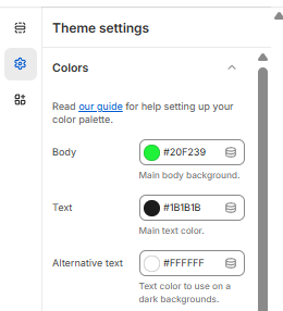
Color settings can be accessed within your theme editor by navigating to: Theme settings > Colors
Select default colors
Background: Choose a light background to enhance readability. This default background color will be used across your site. If changed, adjust the Main text color for a strong contrast.
Main text: Select a color with high contrast against the Background color. For a light background, opt for a dark text color.
Light text: The Light text color serves as an alternative for specific sections, such as dark banner images. This additional setting provides alternative text color options throughout the theme.
Border: Several border shades are generated from this color. The default and lightest shade will exactly match the chosen color. Section-specific settings offer the option to use a darker version.
Selecting primary colors
Background: This color serves as a background for elements with the "Primary" color scheme. The primary background color is used as the main accent color throughout the theme, often applied to call-to-action buttons. We recommend using your primary brand color.
Text: This color is used for text within elements featuring the "Primary" color scheme.
Selecting secondary colors
Background: This color serves as a background for elements with the "Secondary" color scheme. The secondary color scheme is used sparingly throughout your theme. For example you’ll see this applied to the quick-add buttons.
Text: This color is used for text within elements featuring the "Secondary" color scheme.
Selecting tertiary colors
Background: This color serves as a background for elements with the "Tertiary" color scheme. The secondary color scheme is used not used by default in your theme. The tertiary colors will only be seen if it’s selected from section settings.
Text: This color is used for text within elements featuring the "Tertiary" color scheme.
Selecting extra colors
Mobile bar: The Mobile bar color updates the user's top bar above the website. This is used to create a more finished look. This is currently only supported on some mobile devices. We recommend matching your announcement bar to the Mobile bar color.
Background body color
Controls the main background color for the body of the site. This will also be available in other sections when selecting a color and shown as Body.
Foreground body color
Defines the primary text color used in the body content. It's best to use a color that contrasts well against Background body color.
Foreground body dark color
Alternative darker text color for body content
Background primary color
Sets the background color for primary content areas
Foreground primary color
Defines text color used in primary content sections
Background secondary color
Sets the background color for secondary content areas
Foreground secondary color
Defines text color used in secondary content sections
Background tertiary color
Sets the background color for tertiary content areas
Foreground tertiary color
Defines text color used in tertiary content sections
Bar color
Controls the color of dividing bars or horizontal elements
Background overlay
Sets the gradient overlay effect (default is a black gradient)
Input button style
Determines button appearance with options for standard, lighter, or darker styling
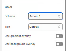
Body is the base color.
Body Neutral is a blend of the Body color and Primary Accent.
Accent 1-3 represents darker shades of the Body color.
Shade 1-3 also represents darker shades of the Body color but with slight opacity, making them semi-transparent.
These colors are directly derived from the color settings.
If the Body color is dark, Accent and Shade can instead be lighter shades of the Body color.
For example, if the background color is black, Accent 1-3 will be lighter shades rather than darker.